

Duolingo
How might we implement a feature into the existing app that allows users to apply what they have learned with others?
Overview
Duolingo is a free education app that uses game-like lessons to make learning a language fun and accessible.
The goal of this project was to implement new features into Duolingo’s app to better meet user’s goals.
Role: Designer / Project Manager
Tasks: Designing, Wireframing, Planning
Time Frame: 2 Week Sprint
Tools: Figma, Trello, MockUp
Platforms: Mobile
Project Management
As the Project Manager, I outlined all of the tasks that we, as a group, needed to complete using Trello. I then spoke with my group, shared the organization style that I created, and together we mapped out reasonable deadlines for each task.
I led us in a conversation where we discussed our strengths and assigned tasks accordingly.
My primary tasks were to make wireframes, design, usability test, and iterate. I also assisted in group tasks, like researching Duolingo and affinity mapping.
Throughout the project, I ensured that we were on track to meet our goals, equally participating, and keeping user’s needs at the forefront of our design work.
Discover
Goals: To understand how users learn. To understand Duolingo’s brand strategy.
User Interviews
Users need a way to share what they have learned
Users like learning with others
Users enjoy being motivated by app
Duolingo Analysis
Duolingo’s mission is to make education free, fun, and accessible to all. They have done extensive research and created their own lesson plans for users to follow that are designed by language teachers.
Affinity Mapping
As a group, my team organized the data from my user interviews into categories based on user’s feelings and needs, using “I” statements to frame them from the user’s point of view. This process aided in keeping users at the center of the design process and ensuring that everyone on my team was on the same page.

Define
Persona: Zari
Needs:
Collaborative learning
Competition is motivating
Connect with others to practice language immersion
Behaviors:
Traveling
Spending time with friends

Design
Design Studio
I led the group in a design activity where we each rapidly sketched four different ideas based on communication, collaboration, and competition. We shared our designs with one another before iterating and creating two designs that were based on more thought-out versions of our designs or concepts from each other’s designs that we liked. From there we deliberated as a group before pulling out the key features that we wanted to implement. I helped us stay on task and not create too many features by highlighting user needs.


Wireframes
Based on the design studio, I was tasked with sketching out the following features:
Add challenge button to skill card overlay
Users win the challenge based on time and accuracy
Add challenge option on the friend’s section of the profile page
Alter navigation bar
Introduce messages/chat page

Wireflow
Then, using the wireframes that I made, I sketched out the flow of the screens that Zari, our persona, would see while using the app. As with the wireframes, I used my iPad and the app MockUp.

Style Guide and Components

As a group, we spent time studying Duolingo’s Style guide and rules before transferring the colors and fonts into Figma.
While designing, I created reusable components so that my fellow groupmates could work on the designs as well.

Deliver
Figma Prototype
Usability Testing

I redesigned this page to have larger buttons to reduce visual strain for users and make the buttons easier to click. We found that the larger size was more in line with Duolingo’s design style and more appealing to users.

I found that users didn’t realize that they were being timed during the challenge, so we implemented a timer throughout the challenge feature.
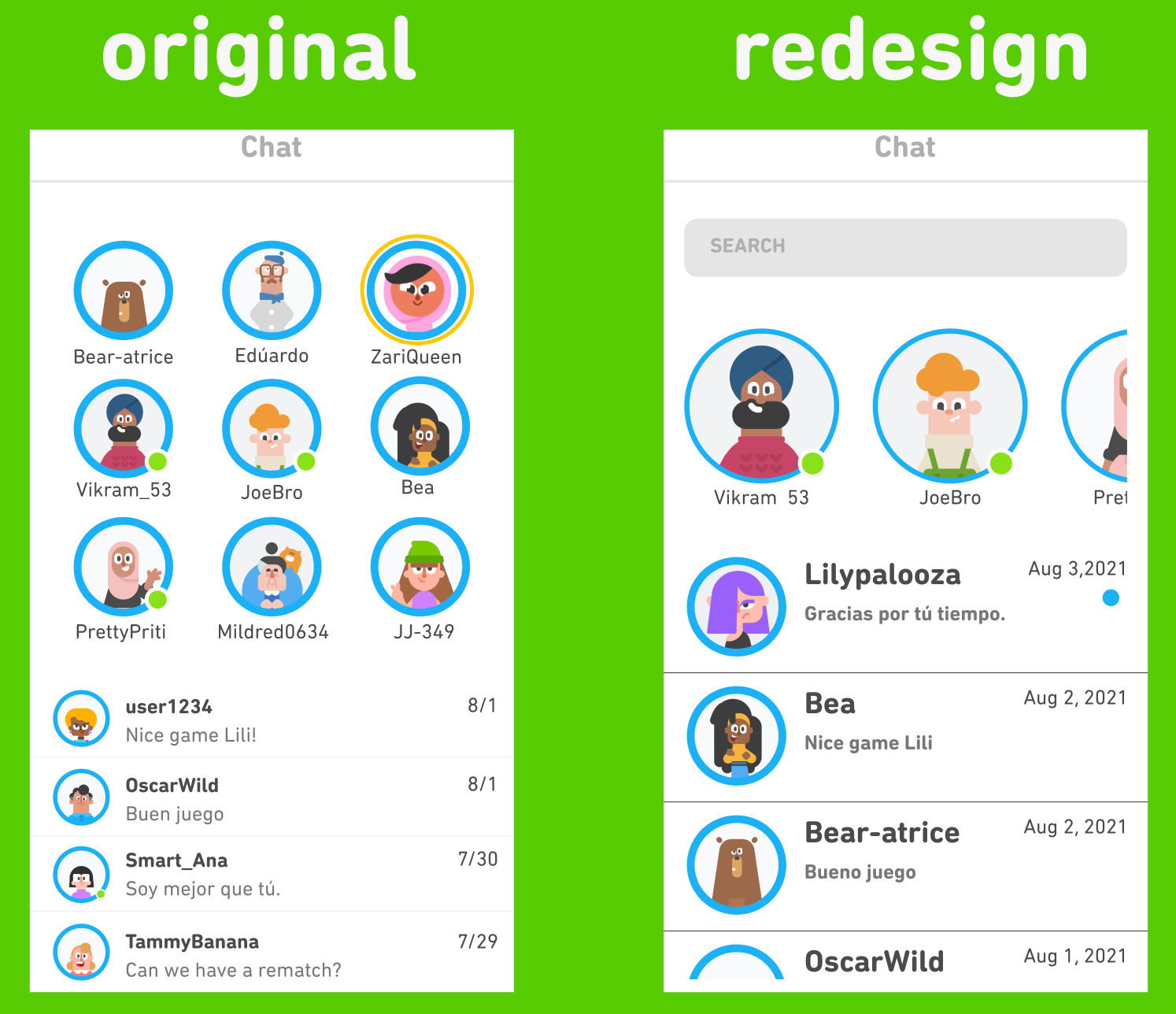
I found that the chat was confusing for Android users and that it was unclear which message was unread. Instead of using a design like iMessage, I created a redesign like Facebook Messenger, which is more used.

Originally, we designed the translate feature to have hover capabilities but you can’t hover on mobile so I changed it to be clickable.
Next Steps
Implement tutoring program
Design more features for other needs discovered during research
Conduct more usability tests
Take-Aways
I love watching my wireframes come to life as other people design them
Planning ahead and leaving room for error is the best plan
Style guides are amazing