

Continued
Website redesign to modernize existing platform and prepare for expansion into new verticals
Overview
Continued is a platform for working professionals to attain continuing education credits and maintain their licenses.
The goal of this project was to modernize Continued’s web app and increase usability.
Role: UX Designer
Tasks: Designing, Research, Prototyping
Time Frame: 2 Years
Tools: Figma, Jira, Maze, Slack
Viewports: Desktop, Tablet, Mobile
Project Athena
This is an ongoing redesign that is currently in production and will be going live in April 2024.
I attended the developers’ agile ceremonies and was involved in the design, iteration, research, prototyping, and developer handoff for the customer- and admin-facing portions of this redesign. I also presented to stakeholders.
I worked with a team of:
4 designers
2 product managers
2 project managers
20 developers
1 QA engineer
Design System
Components
I have worked extensively in the Continued Design System by adding new components that can be easily used by all of our designers.
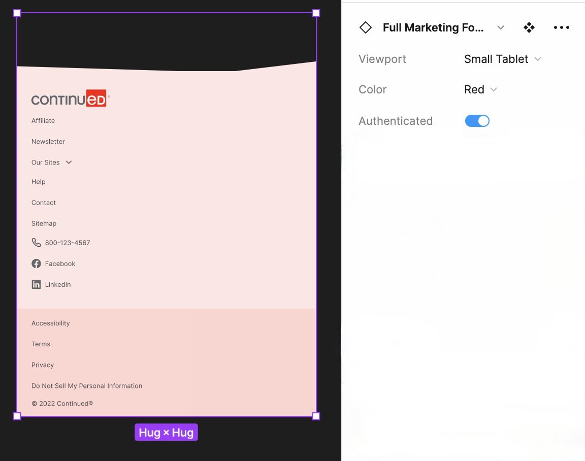
I added both the “Loading” and “Disabled” state buttons to all of our buttons based on WCAG standards and the current Vuetify components that our developers use. I also created the customer-facing footer, with various colors, and sizes for different screens, and hover, active, and focus states. I also added illustrations from Marketing to the Design system so that the UX team could utilize said assets in our designs. This is in addition to smaller changes and additions to the design system such as updating icons, including an image upload preview feature, and adding a multi-select dropdown.


Design
Mobile First
We began designing our internal Admin site using a mobile-first approach until mobile was cut from the scope of the project. Our mobile designs were shelved and we began designing for desktop only, still keeping mobile in mind.
For our customer-facing site, we planned to design for mobile and desktop. During user and competitor analysis we learned that users frequently use tablets, so we always designed for different breakpoints across devices. A few of the pages I designed using auto layout in Figma are below.

Learning Dashboard

Mobile to Large Desktop changes for Learning Dashboard

First Hi-fi mock of the Learning Dashboard

Admin-facing interface

Admin-facing interface that configures the page below

Current customer facing site

Redesign that is in production
Accessibility + User Testing
User Testing
WCAG 2.0
When I design, I always check to ensure that my works adhere to WCAG AA ratings, and are AAA compliant when possible. I cross-checked the color palette that Marketing provided to understand and communicate to the design team which colors were compliant with one another.
I also completed Deque University’s Accessibility course while working on this project.
Used feedback from user interviews to help redesign Evaluation page to be accessible with screen readers
Redesigned Admin facing pages after internal user testing
View “Maze” Project to learn more